


In a funeral slideshow the photos come first, but a few well-chosen words give people something to hold on to. The words in a funeral slideshow usually appear in three places: the opening slide, any captions with the photos and the closing slide. Keep every piece of text short and large enough to be read at the back of the room. Below you will find what to put where, with example wording you can adapt yourself.
The opening slide: name and dates
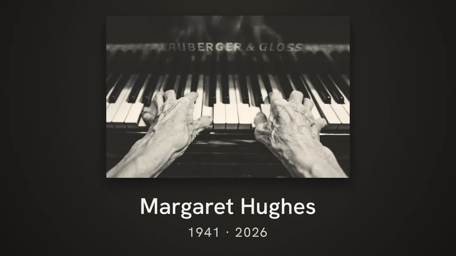
The opening slide is on screen as people arrive. Often it shows the memorial photo, together with the name. What usually goes on it:
- the full name as on the order of service;
- the name they were known by, if different (in quotation marks or on a line of its own);
- the dates of birth and death, or just the years;
- perhaps the place of birth and the place of death.
A few examples of how to lay it out:
Margaret Rose (Peggy) Hughes
12 March 1941 · 3 October 2026
Peter Johnson
1958 · 2026
Keep the wording the same as on the order of service. People often have it in their hands or in their heads, and a difference in name or date stands out. You can read more about choosing the photo for this in choosing the memorial photo.
In our tool the memorial photo is a fixed photo that returns in the blocks you choose, such as the entrance and the final farewell. The tool does not put any text on a slide itself. If you want the name and dates on screen, make the opening slide as an image, for example with the memorial photo and the text together, as on the order of service. You then use that image in the tool as the fixed photo or as the photo for the entrance.
Captions on photos: when to use them and when not to
During a piece of music with photos, people mainly look. Text on every photo distracts, especially when each photo is only on screen for eight seconds or so. People end up reading instead of looking, or they do not finish the text in time.
A caption does help when it tells you something the photo does not show:
- a year or an age on a childhood photo;
- a place, for an emigration, a move or a special trip;
- the name of a person or group that many people present will not know;
- a turn in the story, such as "The Leeds years" or "Grandad".
Keep a caption to a few words. "Cornwall, 1972" is enough. If you want to say more, leave it to the person giving the eulogy. Captions do not have to be in the presentation at all, by the way: a speaker can introduce a photo instead.
Memories as a text slide
Sometimes a separate text slide between the photos works better than a caption. One short memory, something the person who died used to say, or a habit everyone recognises. This is especially helpful if you are making a funeral slideshow with few photos.
Examples you can adapt yourself:
Always first in at work. Always last to leave the party.
"It'll be fine," she said. And usually it was.
His garden was his pride and joy. He shared the tomatoes with the whole street.
The closing slide: a quiet ending
During the final farewell, the music often keeps playing until the room is empty. People file past, stand up or wait. The closing slide is then on screen for a long time, so keep it simple. Some options:
- just the memorial photo with the name, as at the opening;
- a short line from the family;
- a word of thanks to everyone present, if that suits the family.
Examples:
Thank you, for everything.
We will miss you. A little every day.
Thank you for being here today. You are warmly invited to join us for tea and coffee in the foyer.
That last one is practical, but do check with the venue where the refreshments will actually be. If you would rather use an existing poem or quote, first read about poems and quotes in a funeral slideshow, because there is more to consider.
Readable from the back of the room
In a chapel or service room, the back row can easily be ten to twenty metres from the screen. What looks large on your laptop is small from there. A few guidelines:
- No more than two lines per slide. Nobody reads more in time.
- Large lettering. In PowerPoint on a 16:9 slide, ideally 40 point or more for the name and at least 28 point for a caption. If you make the text slide as an image of 1920 by 1080 pixels, that works out at letters of about 80 pixels for the name and 55 pixels for a caption.
- Strong contrast. Light lettering on a dark background, or the other way round. Do not put text over a busy photo without a plain panel behind it.
- A calm typeface. A simple sans serif or classic typeface. Decorative and handwriting fonts are hard to read from a distance.
- Long enough on screen. A text slide should stay up for at least as long as it takes you to read it aloud twice.
Watch the presentation once on a big screen or TV from a few metres away. You will quickly see what is too small. You will find more about backgrounds and contrast in the article on the design and background of a funeral slideshow.
Have names and spelling checked
Mistakes in names hurt, even small ones. A misspelt surname, a forgotten middle name or a grandchild who is left out will be noticed. It happens quite often that the family only spots a mistake on the day itself.
So have all the text checked by someone who has not worked on the presentation themselves. Look out for:
- the full name, the name they were known by, middle names and double-barrelled surnames;
- dates and years, including in captions;
- the names of children, grandchildren and partners, including new partners;
- place names and the names of clubs and societies.
Do this check well before you hand over the presentation. The checklist for playing it at the funeral venue also covers what to check the day before. You will find the full step-by-step plan in our guide to making a funeral presentation.
Frequently asked questions
What goes on the first slide of a funeral slideshow?
Usually the memorial photo with the name and the dates of birth and death, matching the order of service. You can add the name they were known by if it differs. No more text is needed.
Do I need a caption on every photo?
No. During a piece of music, people would rather look than read. Only use a caption when it adds something, such as a year, a place or a name.
How large should the text be?
Large enough for someone in the back row to read without effort. As a guide, at least 28 point for short captions and larger for names. Check it on a big screen from a few metres away.
Can I put a well-known poem on the closing slide?
You can, but with existing poems and song lyrics copyright comes into play. A short line of your own is often more personal and avoids any hassle. You can read more about this in the article on poems and quotes in a funeral slideshow.