
· Last updated on
Choosing photos for a funeral is often the part that takes the most time. There are hundreds of photos, and you want to show a few dozen that together tell the story of a life. With the seven tips below you can make that choice more calmly and more quickly, and you will also know what order to put them in.
For many families a series of photos set to music is the heart of the funeral service. These seven tips will help you make your selection.
1. Less is more
Twenty to thirty well-chosen photos per piece of music tell a stronger story than a hundred. Allow at least six to eight seconds per photo: then the room can really take each one in. At three seconds or less it becomes a slideshow no one can keep up with. In practice we often work with eight to ten seconds, because the transition time from one photo to the next comes off that as well.
Exactly how many photos you need depends on the length of the songs. An average song lasts three to four minutes. If you would like to work it out, read how many photos you need for a funeral presentation.
2. Tell a life in chapters
Work chronologically or in themes: childhood, marriage, children, work, hobbies, grandchildren. A single thread keeps the series calm and logical, and makes selecting easier, because you are looking for a handful of images per chapter.
Is there someone in the family with old photo albums? Is there an old computer or laptop somewhere in the loft, with a hard drive that might still hold some photos? Having photos from across the whole of someone's life is hugely valuable for the funeral presentation.
3. Alternate between portrait and setting
Portraits alone make it static; group photos alone make it impersonal. The finest series alternate: a close-up, then a holiday snap, then a daft moment in the garden.
Consider grouping them around the flow of the funeral. One series with the immediate family, one with the wider family, and one with friends or a hobby club. That way you can place each after a fitting speaker has spoken, and it all comes together nicely.
4. Quality over nostalgia (usually)
Sharp, well-lit photos come into their own on a large screen far better than blurry ones. But a unique, slightly soft photo of the moment is always welcome. Scan old paper photos at at least 600 dpi, or photograph them with a phone straight on from above in daylight, so no bright streaks or marks end up on the image.
Old photos can still look perfectly good when you take a picture of them. It isn't necessarily about the quality; it's about the feeling it stirs in the people who see it. As long as the person who has died comes across recognisably in the photo.
5. Portrait or landscape? Landscape wins
Screens and projectors are wide. Landscape photos fill the frame; portrait photos get black bars. That is no disaster (a calm background colour or a fixed background image resolves it nicely), but when in doubt, choose the landscape option.
Cropping photos is entirely normal. With old portrait-format photos in particular, you'll often see a lot that can be trimmed away (a ceiling or sky at the top, or floor tiles or the contents of a table at the bottom). By removing that, you make the most important part of the photo larger.
6. Ask the family, but keep control
Send everyone who might have photos a request to share them in an online folder such as Google Drive or OneDrive. That gives you a fine collection from family and friends to choose from.
Ask children, brothers and sisters or friends each for their five favourite photos. That way no one misses 'their' photo and the selection stays manageable. As the ones ultimately responsible, the family always decide which photos go into the funeral presentation, and everyone has to accept that. But by flagging your favourite photos, the chances of them being left out are slim.
7. Check the order on the screen
View the series beforehand on a large screen, not just on a phone. Watch for duplicates (two almost identical photos one after another) and for the transitions: the first and last photo of a block linger the longest and deserve extra care in the funeral presentation.
Finished choosing? In the tool you drag the photos into the right order, choose the music to go with them, and the presentation works out the timing per photo for you. It also lets you crop photos easily, so you can put together a funeral presentation simply, without any technical knowledge.
In what order do you put the photos?
Once the photos have been chosen, the question is how to arrange them. There are two common approaches, and they combine well.
Chronologically. You start with childhood and end with the later years. That is easy for guests to follow, including people who only knew the person during one period of their life. The drawback: sometimes one period is very rich in photos (the years with young children) and another almost empty.
By theme. You group the photos around what coloured someone's life: the family, work, the caravan holidays, the football club, the grandchildren. That works well when the photos are hard to date, or when a few subjects really shaped that life.
One chapter per song. In practice it often works best to give each piece of music a chapter of its own. The first song is about the early years, the second about family life, the third about the later years with the grandchildren. Within each chapter you keep the order chronological. That way every song carries a clear meaning, and you only need to choose a limited number of photos per block.
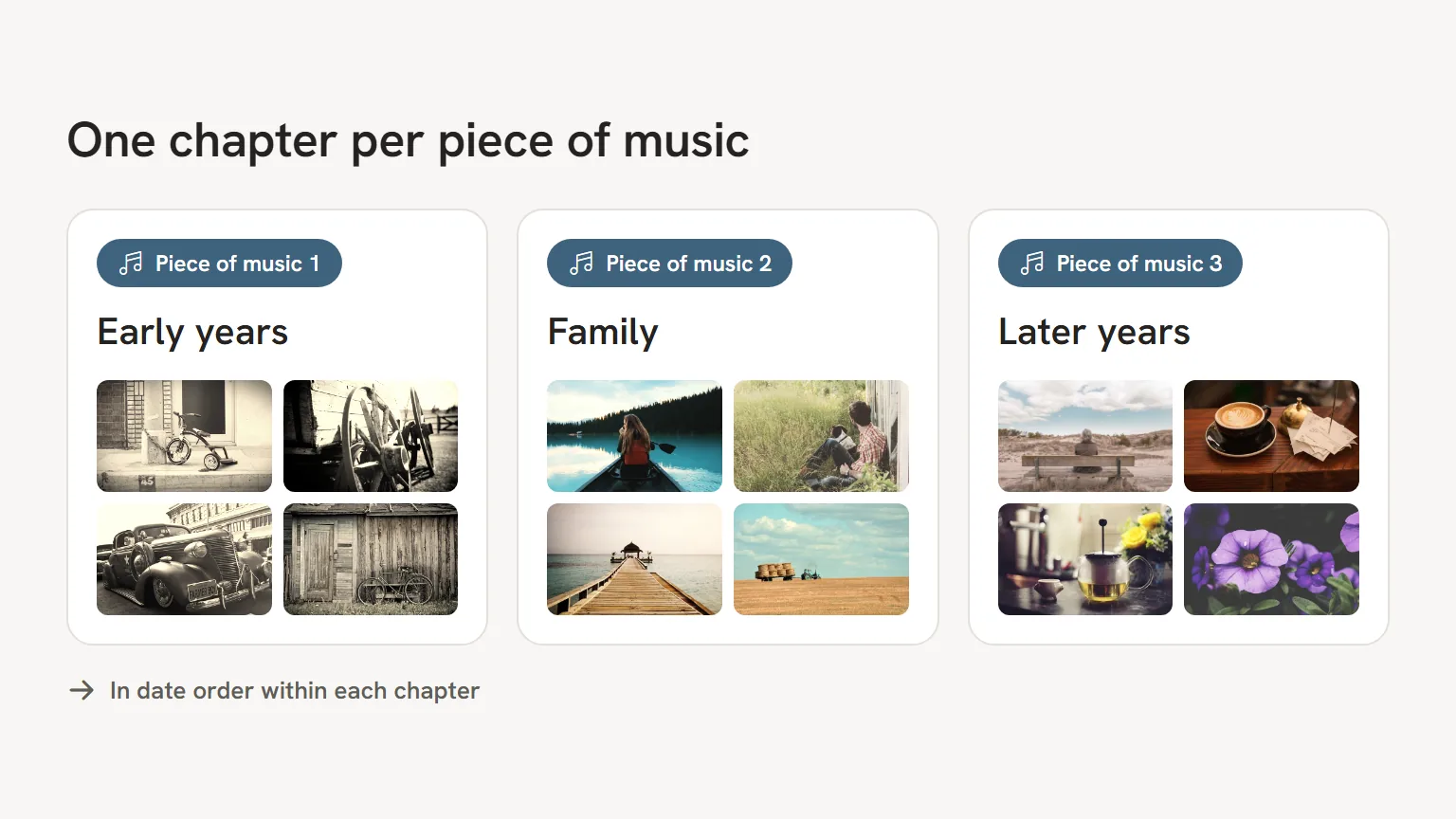
Let the mood of the music play a part. A calm song suits old black and white photos, a more cheerful one suits holidays and parties. What to consider when choosing the music is explained in choosing music for a funeral. In our tool you create a block with photos for each song; the time per photo is then matched to the length of the song automatically.
The photos are one part of the presentation. The whole process, from running order to playing it at the venue, is set out in making a funeral presentation: a step by step guide.
Frequently asked questions
How many photos do you choose for one piece of music?
Allow about seven seconds per photo, including the transition. For a song of three to four minutes that usually comes to 23 to 34 photos. If you choose many more, the series starts to feel rushed.
Can I use the same photo twice?
Preferably not in the same photo series; guests notice. The exception is the memorial photo: that one is meant to return, for example during the speakers and the final farewell. In our tool you choose in which blocks that fixed photo appears.
What do I do with photos that are not very good quality?
A unique photo that is not quite sharp can simply go in. Just don't make it the first or last photo of a block, because that is where everyone looks longest. With a paper print it often helps to scan it again or photograph it in daylight.